Have you ever wondered why you feel more relaxed after spending time in a neutral, light space? Or energized after you were in a colourful, bright room? You are influenced by colour psychology (the connection between our emotions and colour), which has a huge impact on interior design schemes.
Colour psychology is a powerful tool for interior design that affects the mood of a room more than any other factor. Different shades evoke certain emotions, so when choosing colour, it is important to take into account the type of atmosphere you want to create and which colour will help you achieve this.
The colour show different emotions and moods. It is well known that they affect the human psyche, as well as how we perceive spaces, objects and thus have an impact on our way of thinking. It may seem strange, but the colour around you has significant psychological effects. However, most reactions to colour are personal. Therefore, colour and design in interiors should be combined according to the function of the interior and the people who live inside.
Darker colours will make the room feel smaller and more intimate, while lighter colours will look airy and spacious.
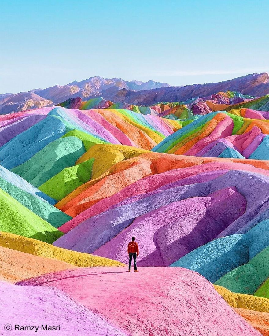
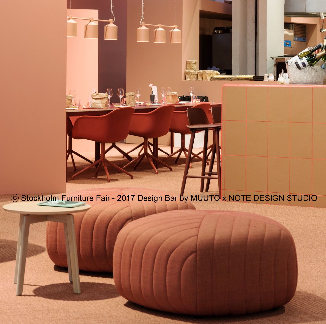
When you want to create a stimulating environment, warmer colours such as red, pink and orange are bold, dramatic and at the same time stimulate energy, creativity but also appetite. These are the perfect colours that will make you feel bright and cozy in the room. But every colour should be treated wisely, too many stimulus colours will act too intensely and can cause feelings of anger. These colours are better used for events such as accessories.
Red is certainly the "warmest" and most dramatic of colours, it has a stimulating and encouraging effect, it supports feelings of energy, strength, passion, desire and determination. On the other hand, red can also exacerbate moods, increase irritability and evoke feelings of war and danger. Therefore, it is necessary to use this colour in moderation, and a wide range of shades of this colour can be selected, such as burgundy, pink, terracotta, and the like. For example, pink represents compassion, care and relaxation.
Orange can be a relatively polarizing. People either love her or hate her. It reminds us of the sun's rays and tropics. It represents enthusiasm, fascination, happiness, creativity, determination, attraction, success, encouragement. Subtler shades of orange are more popular for their relaxing effect.
Cool colours such as blue, green and purple create the illusion of space and can be soothing and relaxing, making them an ideal choice for bedrooms, workrooms and bathrooms. Pairing cooler colours with deeper accents, such as warm hardwood floors, works very well. However, in basic shades, they can be strong and cause inactivity and mood loss, so like most basic colours, they are more appropriate to use only on stock.
Blue is undoubtedly one of the strongest shades of the colour psychology spectrum. It has many aspects related to trust, fidelity, wisdom, trust, intelligence, faith and truth. Light or pastel shades of blue evoke a feeling of peace and tranquility at home. Blue also slows down metabolism and has a calming effect, so it is considered beneficial to the mind and body when used at home.
The green colour, which is considered to be the most satisfying color of the eye, symbolizes growth, harmony, freshness and fertility, and generally gives people a sense of emotional security. Green is an extremely positive shade, it is an ideal colour in spaces where you need to open your mind.
In the psychology of colours, purple is associated with a number of emotions from depth and creativity to imagination and nobility. It indicates luxury and allows you to bring a real presence into the space. Purple is dramatic, rich and sophisticated.
Neutral colours will never go out of style because they tend to simply recede into the background and do not have a significant psychological impact on a person. This is why they are a necessity in the design toolkit, not only can they be used to highlight any other colour selected as the primary, but they also allow for versatile basic choices.
White is the purest colour and is a symbol of clarity, integrity and innocence. It evokes new beginnings and a blank canvas to write on. It opens the way for creativity and turns rooms into bigger and more spacious ones. It contains a balance of all colors in the spectrum, which is a combination of positive and negative aspects. This phenomenon allows ideal use in areas that have many different purposes or where simplicity is needed.
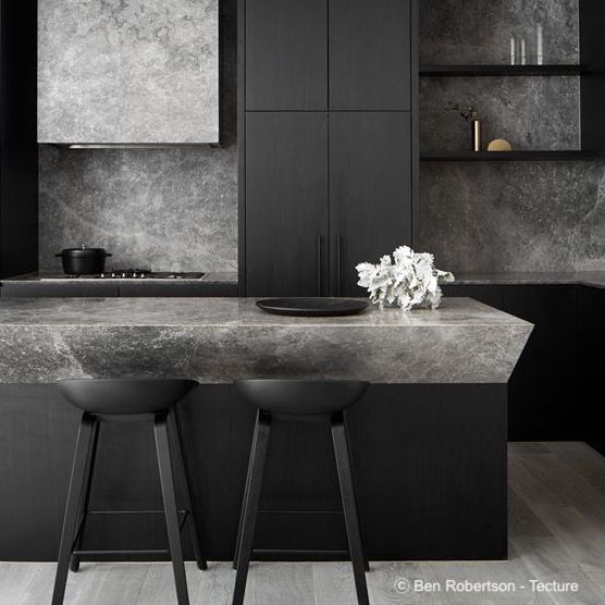
Black is colour in all aspects of life. It is a color that stands out and attracts the eyes. Proven accentuating color, but when used extensively in the scheme of the room, the psychology of this colour leads to a sense of power, drama and mystery. Although black is a technically neutral colour, it will have various emotional and psychological effects. Despite being associated with serious and negative connotations, it creates a mood of elegance and improvement. It excels in a modern and industrial environment, it is a timeless color that offers modern appeal even for traditional spaces.
Gray, on the other hand, is one of those versatile colors that can captivate a wide range of personalities. Gray in colour psychology is thought to affect perceptions of security, intelligence, and solidity. It acts softly and confident at the same time, evokes a feeling of peace and serenity.
Whether we realize it or not, colours affect us and we respond to them. Therefore, before creating an interior, consider how you want to feel in the room. It is important to realize that intuition and personal judgments play an important role in colour psychology. From your own experience, you will know best what emotional effects specific colors have on you, so you need to monitor your own feelings.
Colour schemes are clearly an important factor in interior design. The colour of the walls, furniture, natural elements, decorative pieces, lights and furnishings - all play an important role in the psyche of the population. Therefore, it is always most important to choose color schemes based on the personality and wishes of the client and it is necessary to get an adequate idea of what the client likes and what does not.